Hues of Meaning: Unveiling the Story Behind BIO’s Colour Palette
January 29, 2024 |
4mins to read
The WHYs of our Brand Colours
What are brand colours? To put it simply, it is a set of colours used by a brand to represent themselves and convey their values and personalities to consumers. Let’s try a quick exercise – here are some well-known brands. Can you guess their brand colours at a glance?
McDonald's
Starbucks
Google
Netflix
Domino's Pizza
Why is a colour palette important?
So, how long did it take for you to recall their brand colours? Having a colour palette that brands stick to, creates brand awareness and recognisability for their audience.
Colours have the power to evoke emotions, and interestingly, people often remember these emotions more vividly than factual information. Take McDonald’s, for instance. The mere thought of it brings forth feelings of ‘joy’ and ‘happiness’ – from happy meals and the slogan ‘lovin’ it’ to the playful atmosphere of PlayPlaces and the vibrant yellow of the iconic golden arches. It’s in moments like these that colour psychology takes centre stage, delving into how colours influence people’s perception, behaviour, and emotions.
In essence, colour psychology serves to rationalise the impressions people form about a brand’s colours. Companies carefully select their brand colours, recognising that these choices play a pivotal role in shaping how they are perceived by consumers.
Colour psychology justifies the impression people have toward a brand’s colours, and in turn, these brand colours are chosen by companies precisely because they want to be seen in a certain manner by their consumers.
What are the colours of BIO, and why?
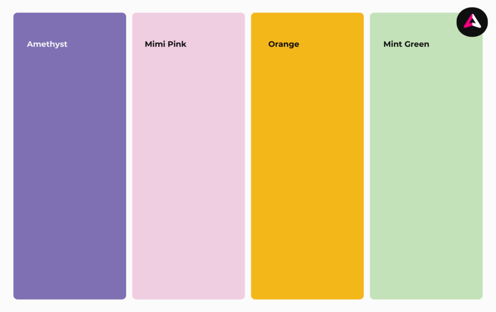
Take a look at the dominating colour in this article – we have this vibrant pink covering the piece. While pink is typically associated with femininity, romance, gentleness, and kindness, this hot pink exudes boldness, loudness, and unapologetic energy – precisely what we aim for to inspire and exude confidence.
In stark contrast is a unique shade of lime – citrus green. It’s an eccentric and vibrant hue that conveys creativity and feelings of enthusiasm, youth, and growth. We believe in the mantra ‘no one is you, and that is your superpower,’ and we’re here to supercharge brand growth for our clients, fueled by creativity and enthusiasm.
We’ve also incorporated an earthy shade of green, which we affectionately call spearmint green. It’s a down-to-earth colour that expresses authenticity and is associated with freshness and creativity. Some even say those who appreciate this shade of green tend to be more open-minded and imaginative – traits that align perfectly with our ethos.
These colours were meticulously chosen for their synergy, creating a foundation for BIO to build upon. The hot pink and citrus green bring vibrancy, boldness, and creativity, adding a layer of fun and enthusiasm to the mix. Meanwhile, spearmint green, with its mellower hue, introduces a more serious and formal tone, complementing and balancing out the palette.
Wait, more brand colours?
Besides our primary colours, our brand designer tastefully curated a secondary set of ornamental colours that goes well with our primary colours.
Why do we need more colours?
1. Complementary: Secondary colours are designed to support the primary colours and spice up brand visuals. Just like how supporting actors don’t get seen on screen as much as the lead actors, your secondary colours should not drown your primary colours out.
2. Flexibility and adaptability: Secondary colours may be updated more often, to better reflect trends or marketing goals. Of course, it shouldn’t deviate too far off from the original palette.
The hues of meaning in every colour palette
Every brand’s colour palette holds hues of meaning. From the careful selection of colours to the deliberate inclusion of depth and meaning, each colour is a testament to the brand’s values. Explore our portfolio page to discover how Bio has uniquely brand stories for various brands, each with a colour palette that distinctly defines their stories.